
Thursday 31 March 2016
digipak update
advert update

I also did not like the colours Lucy was wearing in the last advert so I took extra photos and added them to the advert.
Thursday 10 March 2016
digipak update
this is the outside of the digipak at it's current stage however I am still not happy with the photograph of lucy as it is too bright. I might take new photos to use for this.

Poster update

I have realised the photos of lucy are too bright to fit with the style therefore I will take new ones
Digipak Progress 7

Digipak progress 6

As with the advert, the photo was too bright. I de-saturated it however her face was still too de-saturated after doing that therefore I have selected her face and neck to re-saturate it.
editing digipak photo of lucy

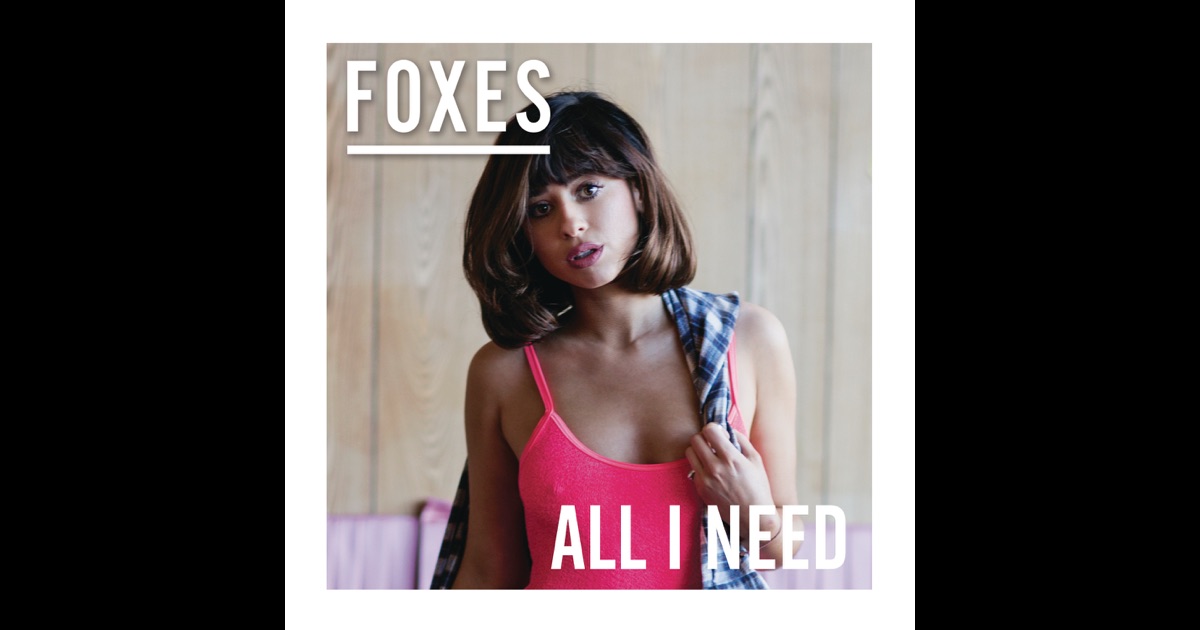
This is the photo of Lucy I am using for my digipak.

I have flipped the image so it will be facing away from ellis and selected the background ready to use the mask tool again and change the background to nothing. this will allow me to place her on the plain black background of the digipak.
Digipak progress 5

I have placed Ellis in a box to match the advert as it has sort of a house style. I have placed a line down the middle of the box to create distance between ellis and lucy after I place her into it.
advert progress 7

advert progress 6

editing lucy for advert


I have cropped Lucy and selected the background and used the masks tool to mask the edge and smooth the outline out to place onto a new background instead of the green background.

I used the colour replacement tool to get rid of the green tint on Lucy's jumper.

I will then make suitable touch ups to make it look right with the rest of the advert.
This is how I edited all of my photographs of ellis to go onto the advert and digipak as well as how I plan to edit the photograph of lucy for the digipak
advert progress 5

I have also moved the text around to make it look more spaced out and not have everything down in the bottom.
Tuesday 8 March 2016
digipak inspiration

Friday 4 March 2016
Digipak and advert progress 4


digipak style models
these are the digipaks I am using as partial style models to my own. I am also taking these into consideration whilst making my advert as the digipak and adverts of a certain album will usually look very similar.

digipak progress 3
I decided to alternate the digipak and advertisement so that in one Ellis is looking towards the camera and in the other he is looking away from Lucy. This gives a sense of distance which links to the music video of them being apart.
I have updated the digipak with a photograph of Ellis. I am still to take photographs of Lucy to use on both the digipak and advert.

I am keeping it very minimalistic as covers of digipaks aren't usually very packed with text.
I have updated the digipak with a photograph of Ellis. I am still to take photographs of Lucy to use on both the digipak and advert.

I am keeping it very minimalistic as covers of digipaks aren't usually very packed with text.
Magazine Advert Progress 3
I have placed the photograph of Ellis onto the advertisement however cut it off with a square box as it did not look right with his whole body underneath the text layers. I need to take photographs of Lucy to use on this however the rest is done and not much adjustment should need to be made after the photos are taken and edited ready to put on the poster and digipak.


I created the hmv logo myself as it is a common feature on an album advertisement that it will have where to buy the product from. I typed out "hmv" and went through the fonts until I got the right font. I then colour picked the colour from the existing hmv logo to make this more realistic.
Thursday 3 March 2016
Update on Ancillary task
I have went back to my Advertisement Poster as I took a photo of Ellis that I liked. The background of the photograph doesn't have much of a different colour to his hair however the background of the poster is also black therefore it should not be much of a problem. When I tried to edit the brightness of the photograph the background changed colour on the photo and did not blend into the background of the poster.

I will get rid of the background of the photo as best as I can and then place the background of the poster back onto it.

I will get rid of the background of the photo as best as I can and then place the background of the poster back onto it.
Wednesday 2 March 2016
alternative endings + target audience response
I filmed from two angles to get the last shot for my music video however could not decide what was the most effective so I took it to my target audience to find out what they preferred. I got feedback and decided Ending 2 was the most effective and the audience got a better understanding with this one, however i liked the happiness in her facial expression in the shot from the front angle therefore i have incorporated this into the ending still.
Subscribe to:
Posts (Atom)